Mapping Fly Ash: The Hidden Geography of Cement Replacement
Intro
In the previous post, I looked at how cement replacement shows up across 72,000 concrete mixes, which raises a natural follow-up question: where is all of that material actually coming from? Given the prevalence of fly ash in that dataset, understanding its supply becomes particularly important. This is especially true as it remains a relevant cement replacement despite a declining coal industry.
This post runs through a mapping of active coal plants and concrete plants in order to explore access to fly ash. The goal is to better understand travel distances and the associated environmental impacts of transporting fly ash. By visualizing the distribution of concrete plants relative to coal plants, and enabling a search for the closest pairings, we can also highlight potential nearby sources.
I will preface this post with the admission that I am in no way an expert on fly ash or concrete for that matter. Much of what I discuss below may be common knowledge to people embedded in the industry. However, approaching this from the design field, I suspect that fellow architects and structural engineers – the ones often tasked with specifying these materials – may find this perspective useful.
I start by looking at what the National Ready Mixed Concrete Association (NRMCA) says about transportation modes and distances for fly ash, then review what prior research tells us about transportation impacts, before walking through my own analysis and the web application I developed from publicly available data.
NRMCA Data on Travel Distances
Before getting into the mapping based on the data pulled from both the EC3 database and Global Energy Monitor, it’s useful to see what NRMCA data reports for transportation distances for fly ash as a benchmark. In the NRMCA Industry Wide LCA Project Report – V 3.2, they break down the transportation distances of the different materials commonly used in concrete mixes based on the transportation mode. The breakdown for the National Averages is shown below.
The report also breaks this data down by eight regions in the continental US. Since availability and travel distances vary significantly by region, this is a more useful way to view it. Since the LCA report doesn’t give us an easy ability to view all the regions in one visual, I developed the following map to overlay the transportation modes related to fly ash.
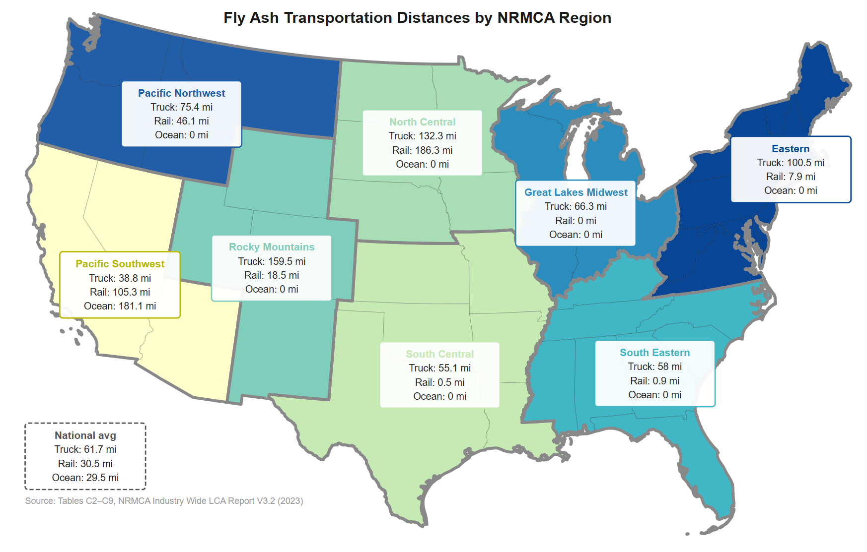
The distances in the NRMCA report are production-weighted averages self-reported by 489 concrete plant operators based on a 2019 survey conducted by NRMCA and the Athena Institute. The production-weighted averages means that a high-output plant’s reported distances carry more influence on the numbers than a small plant’s. Important to note here is that the road transport A2 emissions are “adjusted for backhauls”, though it is my understanding that the reported distances in the tables are still representative of one-way hauls.
Some observations on these numbers: the distances across all transportation modes are surprisingly low, but there are likely a few valid reasons for this. Many supply chains likely involve multiple transportation modes, so plants near ports or rail terminals may have very short trucking distances. Additionally, production-weighted averages may skew results lower when certain legs of a trip are negligible or zero. For example, on the Pacific Southwest we see an average distance of 181.1 miles for ocean transport. The fly ash accounting for this is likely coming from China and traveling over 5,500 miles, but it gets weighted down by all the trips that don’t require ocean transport.
Impacts from Transportation
EPD data and prior research consistently show that transportation is a relatively small contributor, percentage-wise, to total Global Warming Potential (GWP) for concrete. The main LCA scopes typically accounted for in these studies include: A1 (raw material extraction), A2 (material transport to plant), and A3 (manufacturing). While there’s some variability based on the regions and the types of mixes, we can derive the following percentage breakdowns for GWP from the NRMCA industry EPDs:
- A1: ~80–90%
- A2: ~7–15%
- A3: ~2–8%
The A2 category consists of the transportation of multiple materials that go into concrete such as cement and aggregates. So when fly ash is involved, it’s an even smaller fraction of the ~7-15% seen above. That said, as cement replacement increases, we’d expect the impacts from transportation to grow as a share of total GWP.
While GWP has served as the primary metric for analyzing the environmental impacts of building materials, it is important to also consider other environmental measures. An in-depth study from the University of Toronto on the effects of transportation of fly ash compared a range of mixes including fly ash replacements of 0% (baseline), 25%, 35%, and 50% in order to find ‘break-even distances’ for various environmental measures. This report find that the “three environmental impact categories that most greatly affect the LCA of concrete due to the transportation of fly ash by truck are (in order of greatest affected to less affected): (i) ‘ecotoxicity’, (ii) ‘human toxicity (non-cancer)’, and (iii) ‘resources and fossil fuels’. In contrast,
global warming potential, which is most often reported in the literature corresponding to transportation processes, was observed to be minimally affected by the transportation of fly ash.”
So while the transportation involved in concrete production may not be the primary lever for impact reduction, it shouldn’t be dismissed. Especially where SCMs make up a larger percentage of the mix, material travel distances should be considered when taking a holistic approach to environmental impact considerations.
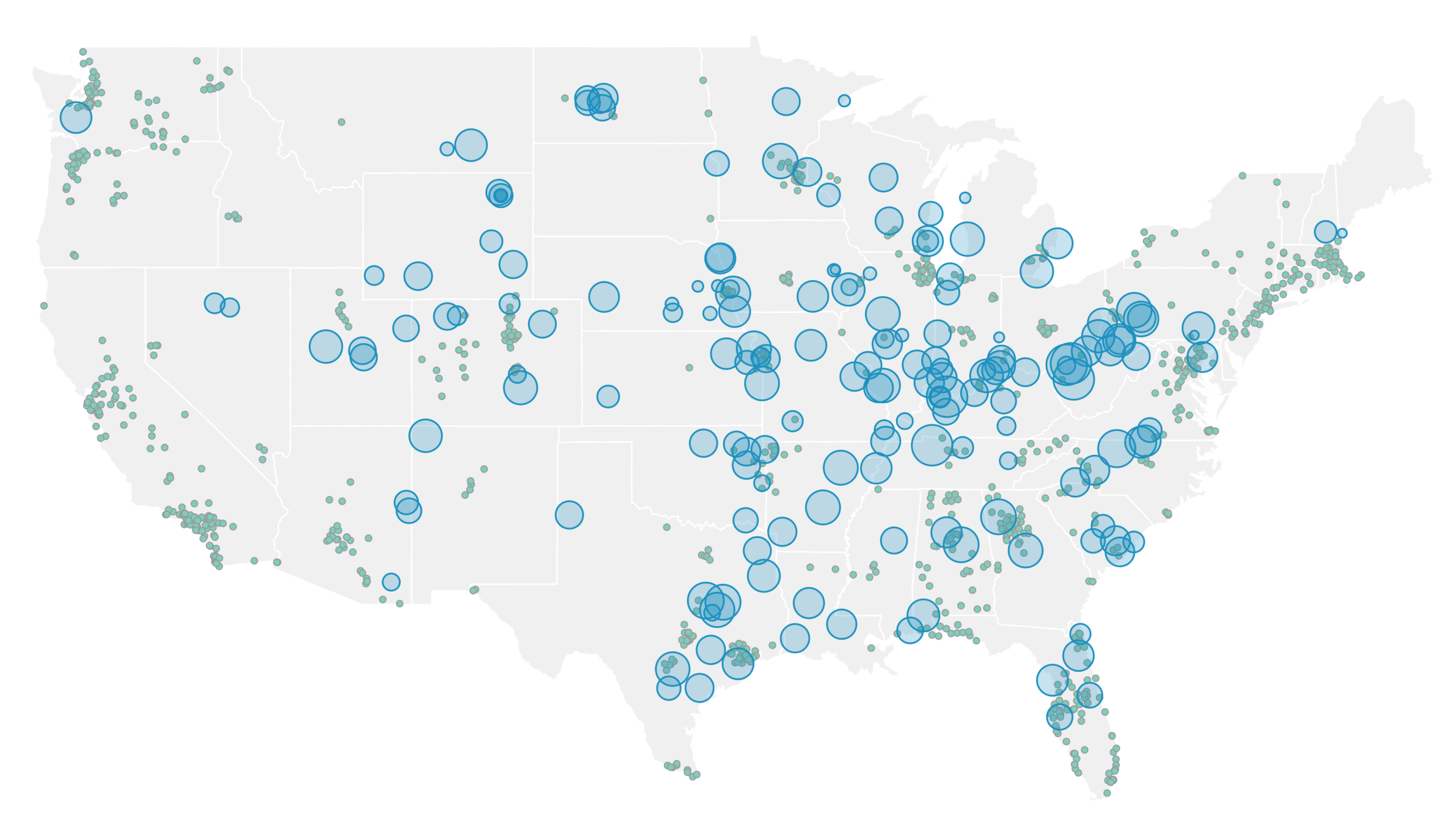
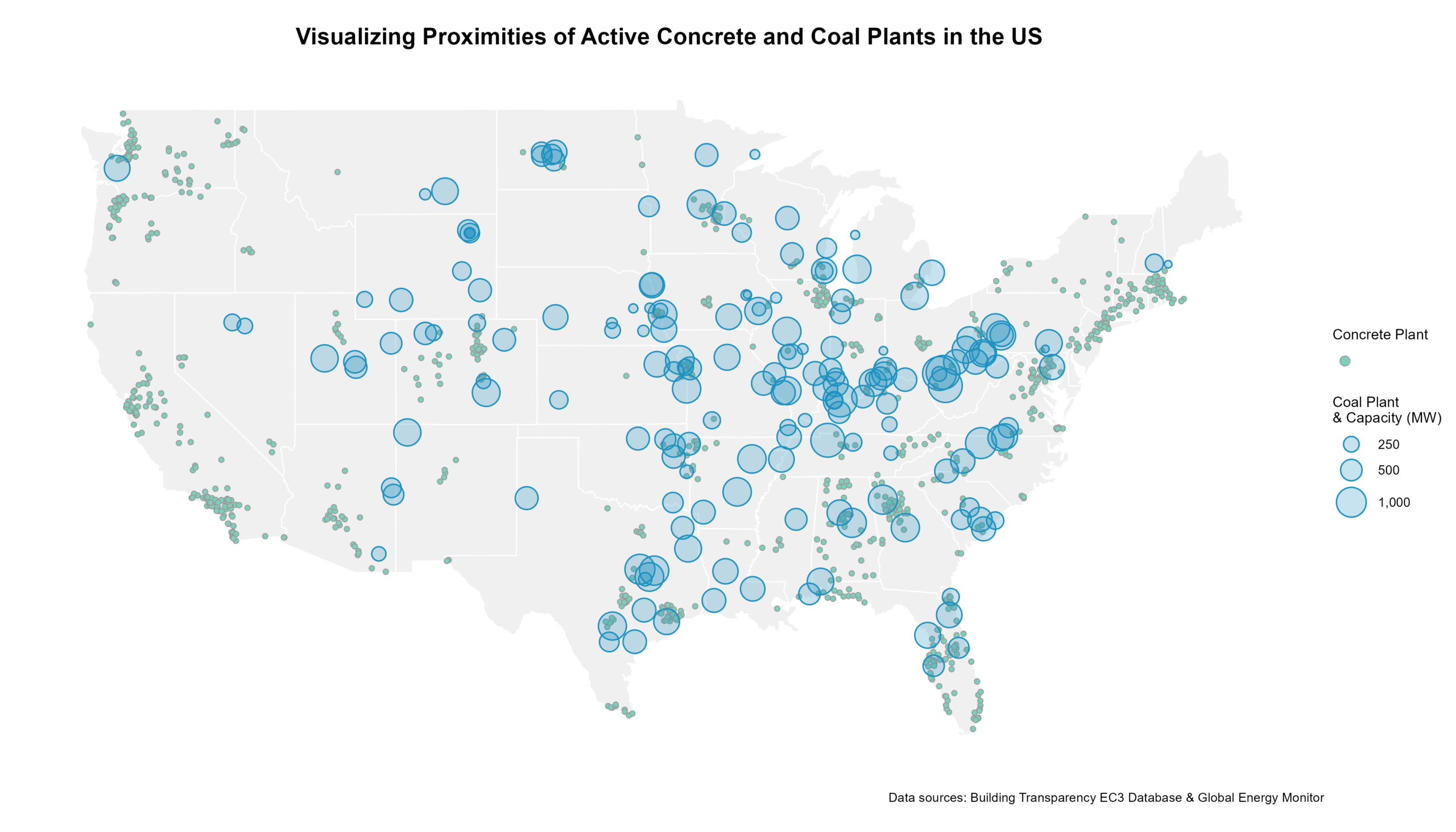
Mapping Plants
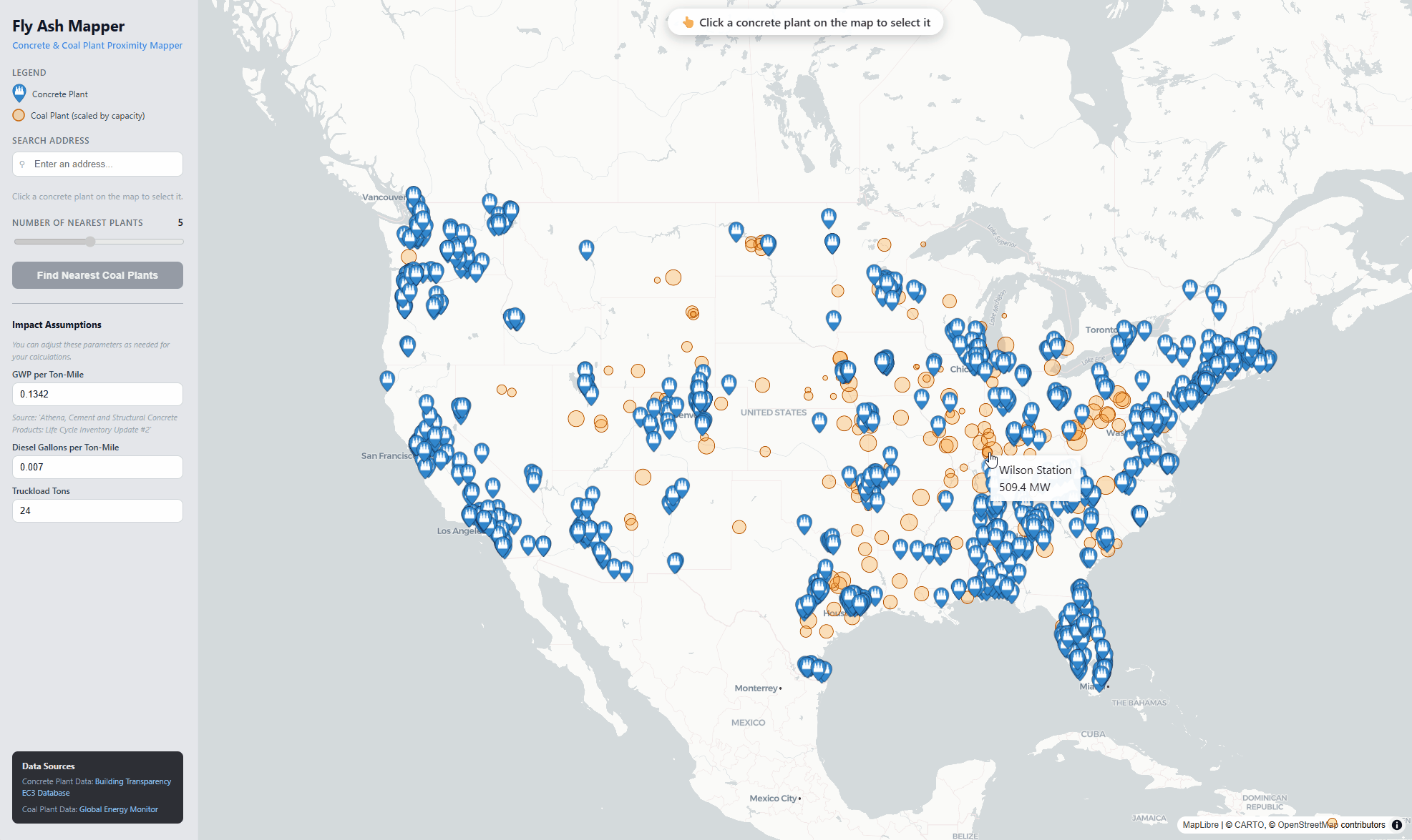
During my research into the topic I had come across some partial maps of concrete plants and some maps of coal plants across the US, but did not see anything that brought this data together. Beyond a visualization, I wanted to build a tool to calculate the closest coal plants (sources of fly ash) to a given concrete plant by road distance.
In reality, rail and – to a lesser extent – ocean freight play a critical role in the mix of transportation means, but attempting to fold these methods into this mapping would involve a lot of guesswork and would complicate things. I’m aware that the assumption that fly ash moves directly from coal plant to concrete plant is a simplification in many regions, but it’s still useful for understanding potential proximity.
The mapping below, and the web app that have been developed are based on data that included 1,042 active concrete plants and 181 active coal plants in the continental United States. The concrete plant locations are extracted from the original dataset of EPDs pulled from EC3, and filtered down to unique plant locations with geographic data. While these concrete plants represent only about 15% of the total concrete plants (as mentioned in my previous post, NRMCA estimates there are roughly 8,000 concrete plants in the US), they provide a decent representation of the distribution of concrete plants. The Coal Plant locations come from Global Energy Monitor data that tracks information on active coal plants from around the world generating 30 megawatts and above.
This initial mapping of all the plants was intended to provide a simple understanding of the distributions of plants. As we would expect to see, the concrete plants tend to be more evenly distributed across the country (concrete is used everywhere) with clustering near major cities. Coal on the other hand is more regional, with the denser clusters being in the midwest and almost no coal plants along the Pacific coast and the Northeast. This would explain why we see ocean freight playing a larger role in the supply of fly ash along the west coast, where it can be more economical and even lower emissions to ship fly ash from Asia by sea compared to trucking long distances.
To extend this into something more interactive, I developed a web application called the Fly Ash Mapper (found at flyashmap.matterflows.com). This app allows the user to select a concrete plant and then calculate and map the n number of nearest coal plants based on routing distances from OSMR. In addition to distance in miles, the user can also see some information on total emissions and diesel used per truckload (values represent one-way distances). Further charts and data may be added to the app in the future – open to suggestions!
Comparing NRMCA Assumptions to Calculated Values
While this isn’t an apples-to-apples comparison, I was curious how NRMCA road distances compare to calculated distances to the nearest plants. In order to create a comparable number to the NRMCA value, I found the closest coal plant to each concrete plant and then averaged those distances based on the same regional boundaries defined by NRMCA. As discussed, the data collection approaches are very different (surveys of concrete plants vs mapping based on known data). Additionally, and likely more importantly, NRMCA distances likely reflect trucking as just one leg of a broader transportation network. The comparison of the distances is shown in the table below.
| Region | NRMCA Truck Distance (mi) | Avg Calculated Distance (mi) |
|---|---|---|
| Eastern | 100.5 | 140.1 |
| Great Lakes Midwest | 66.3 | 76.4 |
| North Central | 132.3 | 64 |
| Pacific Northwest | 75.4 | 359.4 |
| Pacific Southwest | 38.8 | 473.3 |
| Rocky Mountains | 159.5 | 112.6 |
| South Central | 55.1 | 85.6 |
| South Eastern | 58 | 101.4 |
| National Average | 61.7 | 197.3 |
While some of the distances between the NRMCA and the calculated averages to the closest plant are close, others – like on the west coast are far off due to the reason I mentioned previously. The North Central region also shows a discrepancy where the calculated distance is significantly less than the distance NRMCA provides. This discrepancy can be attributed to a handful of reasons, and I suspect a big one is simply a small sample size given that this is one of the least populated regions.
Wrap-Up & Notes
This mapping analysis was largely an exploratory exercise from a non-expert perspective. That said, there are useful takeaways for those specifying cement replacement materials, particularly in understanding potential sources and engaging with suppliers about sourcing. At least in the near term, fly ash will continue to make up a large portion of cement replacement, and how effectively we source and reuse it will matter.
- Links to Analysis Scripts on GitHub:
- The Fly Ash Mapper app is still a proof of concept. If you find this useful and are interested in other features, feel free to contact me.
- This work was conducted as part of my capstone project for the Environmental Data Science Certificate Program at the Yale School of the Environment.